All Toronto Blue Jays logos are accounted for!
All Tampa Bay Rays logos are accounted for!
The current representation of the Tampa Bay Rays is strangely absent. I usually stray away from doing current years, but I also feel it's important to at the very least have up to date logos at the ready.
Most versions of Chief Wahoo are available, but a notable exception is the version that was there when Cleveland last won the World Series. Not at the top of my to-do list, but I'd still like to cover that team.
Before the fun and cartoony Chief Wahoo, the Indians utilized more serious and straightforward logos to convey their nickname. This is perhaps the lest cringy of the ones the Bot currently lacks...
Priority: Low
The White Sox won a World Series with that look, and I'd like to have it available for when I cover that team, as well as the proper logo for the Black Sox team of 1919.
Hats off to the Bot for including not only the logo for Chicago's 1906 title, but a small handful of random early years looks...but they currently lack the look for the infamous 1919 Black Sox.
Priority: High
The Tigers are like the Yankees where they've had a very consistent look over the years. This is one look the Bot doesn't have that Ty Cobb played under. The Tigers used a bunch of various Olde English Ds that the Bot mostly recognizes, then in 1922 they officially introduced one version that served at least as an alternate logo that still stands to this day, which is hugely helpful, but the Bot still uses other primary logos that look real good....so why am I highlighting that crudely drawn tiger head above? Because that 1957-1960 look would slowly transition to the 1964-1993 logo that is in the Bot already....but that '64-'93 logo is erroneously coded to represent every season from 1957-1993. This could simply be coded to make '57-'63 covered by the Olde English D, but having the two missing primary logos that led into that '64-'93 logo wouldn't be bad either.
Priority: Low
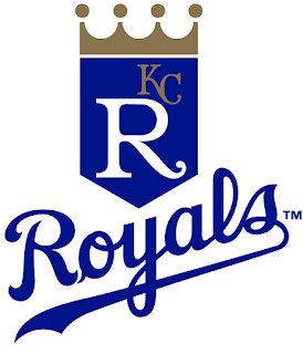
I've mentioned this before, but the Royals have had a look that seems like it never changes but actually features multiple tweaks over their history.
This original look is one such example. The above logo is the 1993-2001 version, and is tweaked from the 1986-1992 version that is essentially the same. However, the '93-'01 seasons in the Bot are represented by the 2002-2018 logo which is much different. It would be another easy fix to just code the 1986-92 logo to also cover the season up to 2001. Yes, I am splitting some serious hairs here.
Plus, there was a time where the Bot had it right for the Royals of that era...and
I have the cards to prove it.
Priority: High

The Twins are another team that has recently changed their current logo and the Bot doesn't recognize it yet. Not only that, but this is also valid for their early years where the Bot also doesn't have a proper logo in place. This one could pull double duty and have the Bot cover all the Twins years.
[Update] I'm not in love with the "corporate" logo the Twins utilize, but I've made peace with it. The Combined TC logo is still valid for every Twins season, but that would be intentionally ignoring this original logo that was in place for 15 seasons before they tweaked it to add the "Win Twins" caption and alter the color.
Priority: Low
All Texas Rangers logos are accounted for!
Yup, I'm still harping on about this Rangers logo. Only because all other versions of the Rangers are accounted for by the Bot.
All Seattle Mariners logos are accounted for!
All Houston Astros logos are accounted for!
All other versions of the Astros are in the Bot. This is about as low priority as it gets for this list since the slightly altered version of this logo is covered, but this is just different enough to be noticeable.
All Los Angeles Angels logos are accounted for!
I really don't want to skip ahead in my perfect game series, but the Mike Witt entry is waiting on the correct logo.
Not only is this the only version of the Oakland A's that the Bot doesn't feature, but it's the version that won 3 straight World Series. How can this one be absent?
All Oakland A's logos are set, and all KC Athletics seasons have valid logos...and for good measure the "homeless" A's logo is current, so all that remains for the Athletics franchise is for most of their Philadelphia logos, which is covered below.

The Philadelphia A's logo for their entire history in the Bot is the same "A" logo. Why not recognize when the elephant (which has followed the franchise to KC, Oakland and probably Vegas as well) on some cards?
Priority: High
The St. Louis Browns have a great logo in the Bot, but this one not only goes back to the team's beginning, but also had a longer presence that the fleur that the Bot currently uses for every season the team existed.
The Browns are mostly represented in the Bot now, but there's this very early design from 1905 that gives a unique design for such limited choices from early baseball logo possibilities. It's very similar to the design from 1902 that the Bot recognizes, but the S and T are vastly different once you know to look for it....yeah, this is me splitting hairs again.
Priority: High
Before the Expos moved south from Canada, there was another team in DC known as the Nationals. Someone tell that to the Bot, who seems to think the team was always known as the Senators. Like for the Boston Americans, this update should not only correct a proper logo, but also clear up mistaken identity for the team. The Bot now recognizes the Nationals, but with the 2nd version of the W. I'll pettily leave this simplified version and downgrade the priority.
Priority: Low
The various histories of the Washington baseball teams can get a little confusing. The current Senators v2 features an accurate W logo that was later adopted by the current Nationals team. While that W is technically accurate, it feels wrong, not to mention inaccurate for the first couple of seasons of the franchise...and all the while, this unique logo exists that's valid for all of the pre-Rangers seasons of the team, letting them stand apart from the pre-Twins and the post-Expos Washington teams.
Priority: High
The Bot has a weird relationship with the Braves teams in history. That logo for the Braves is featured during their Milwaukee days, but not the original Atlanta days. The Bot uses a lower case "A" logo, which was never even an alternate version. Proper representation is the name of the game here.
One way or another, every Atlanta season has appropriate logos. One or two might be off by a year, but that will only really be noticed by neurotic fans like me, and I think I'll sleep just fine at night over it....so instead let's petition for what the Atlanta Braves looked like when they were the Boston Beaneaters, and how they were depicted when baseball entered the modern era.
Priority: Low
All New York Mets logos are accounted for!
All Miami Marlins logos are accounted for!
I find it funny that the Bot covered a number of older and interesting logos for the Phillies, but not their current look. The 1992-2018 primary logo was retired.
Now that we have the current Phillies logo, let's go looking for the Saturday morning kids tv version...
Priority: Low
A lot of Reds logos over the years are covered by the Bot, but the 1919 WS team should get some love.
The Bot put in some work getting many of the early era logos in recently, but one of the only two missing logos is this nifty look a bit later in the century.
Priority: Low
I figured this logo for the Cubs would be an easy add. I was wrong. While even the slight tweaks to their logo have representation in the Bot, this classic from their 1900 days is still ignored.
The most recent Cubs logo that's missing, even if they all bleed together with how similar the design became.
Priority: Low
This is such a cool logo for the Pirates, I hate how the Bot is making us settle for the plain yellow "P" logo while slick looks like this one are constantly ignored.
[Update] Yeah, that logo is floating around somewhere in the Bot, but in the wrong years. I don't know why it's available for 1909 but not for the proper 1987-1996 seasons it was in use.
We now have the best Pirates logo available, as well as a few other logos with actual pirates. Might as well yearn for the original Pirates logo, which they showed off in the first World Series.
Priority: High
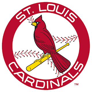
This might be the most petty request on the list. All seasons of the Cardinals are safely covered...except 1998. It might have been a mistake by the franchise to have put out this look where the beak was made red, and that's why they corrected it a year later. If there was one suggestion to possible ignore and have me not even care, it would be this one. But at the same time, I think it be cool to point out for my above mentioned idea for strange logos.
So the all-red cardinal variant is still missing from the Bot, but if I were to pick one petty request to be added, it's not the 1965 logo with the no-hat cardinal.
Priority: Low
All Milwaukee Brewers logos are accounted for!
This is a small blip on the radar for the Brewers, but this was their look for a short while before their current logo was made. All other versions of the Brewers are already in the Bot.
Just like the Yankees, the New York Giants didn't always have an interlocking NY logo. The 1905 champion team, for example, won with the above. But, if I'm gonna wait for the proper Boston Americans logo, I might as well wait for this one as well.
The New York Giants changed the color of their logo so many times, it would be fruitless to request any one specific missing logo from that era. There is the one interlocking NY logo for the Giants, and that's gonna have to be good enough right now for the franchise that just couldn't come to a decision. In the meantime, I'll highlight the lone missing logo from the San Francisco era.
Priority: Low
All Arizona Diamondbacks logos are accounted for!
The Diamondbacks just made this their look for 2024, so it's understandable why it's not updated...for now.
For one season, the Brooklyn Dodgers were green and not blue. I'd love to cover that season, but the Bot needs to know about it first.
The Dodgers utilized a few different variations of the letter B while in Brooklyn before they settled on the iconic look that we all remember, like this one from the start of the modern era while they were still known as the Superbas.
Priority: Low
This logo for the Padres used to be in the Bot, and I have the Tony Gwynn cards to prove it. Restore the proper 80s Padres logo!
Pettiness alert! Now that the proper 80s Padres logo is restored...and I'm learning to accept the current alternate-logo of the team as close enough to what they used in their early years, I'm left with a couple one-off single year use logos like the above from 1991.
Priority: Low

I will die on this hill. There were two versions of the Expos logo in their history. The Bot should recognize the early seasons of the Expos even if the logo wasn't altered by much. That being said, not like there were many notable teams for Montreal besides 1994...
[Update] So both logos are available, just depending on what card year you choose to utilize, which is annoying. Yeah, it's not a huge deal, but it's maddening at the same time.
Priority: High
Another hill I'll die on. This is the version of the Braves that Babe Ruth ended his career with. I don't care if the later version looks way better, I demand it for Ruth!
The Boston Braves briefly became the Boston Bees, but they soon became the Braves again. When they did, they used this logo for a bit. It's the only Boston Braves logo missing from the Bot.
Priority: Low
As mentioned above, the Braves became the Bees for a while. They used four logos in five years, with this one being most prominent.
Priority: High
When the Boston Braves became the Milwaukee Braves, they took this logo with them, but strangely the Bot doesn't think so. So while I can't stand the fact that this logo is all we get for the Boston Braves, I also can't stand that I don't get it for the Milwaukee Braves. Accuracy, damn it! Accuracy!
I told you I'm petty for some of these.
The future Braves were briefly known as the Boston Doves. They used a few different logos, but they all seem related to other more identifiable teams. They had a red B in the style of the Brooklyn Dodgers, and there was also an Olde English B, but the Tigers seem to have a strong hold on the Olde English letters. So the above logo is at least unique.
Priority: Low
[Update] All in all, I am very grateful for the logos and teams that Mr. Gula has featured on the Bot. There is bountiful potential with what is available now, but I also am tempted by the potential for more!


