Logo Wishlist - updated
I did this before, and got a lot of what I asked for in no time. I'm not suggesting that Mr. Gula updated the Bot with the logos because I asked specifically for them, but just in case it's a possibility, I'll showcase more missing logos that I'd love to see pop up when I generate a card...
I'll try not to obsess TOO hard over the really old logos...
...as always, Sportslogos.net the the place to go for reference...
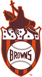
The St. Louis Browns get one little logo to represent them for their entire history. We can do better.
Still holding out for the OG Atlanta Braves logo. Can't imagine depicting Hank Aaron without it. Call me stubborn, I don't care.
This is what Babe Ruth was rocking at the end of his career. That's the only reason I'm willing to die on the hill for this particular logo.
The Cubs have added logos, but why not the one they had when they won their final World Series before their 100+ year drought?
The 1968-1992 Reds logo I wished for was granted, so now I'll gripe about the really early logos, which are very similar, yes, but the 1919 era logo is distinct enough to where *I'll* know it's wrong if I use something else.
I'm kinda being a stickler, but this version of the Expos logo was the norm until the '90s when they added a bunch of stuff surrounding the letters. That "surrounded" logo is erroneously used by the Bot for the entire history of the Montreal franchise as opposed to just the 90s. Am I really gonna draw a line in the sand over this? No. But I just wanna point out that I've messed around with creating so many cards for so long that an obscure situation like that got noticed.
The Pirates for the most part still have that uninspired "P" logo define them when awesome graphics like this should be in place.
The original 1903 Boston team was NOT red.
The original look to the Royals that hung around for 10 seasons
Specifically my Mike Witt perfect game cards are waiting for this proper California Angels logo.
This version of the White Sox won a World Series, and it predates any variation of saying "Sox"
Probably not worth the two whole seasons it was utilized for the Rangers, but there was this logo between the cowboy hat and the cleaned up Texas silhouette.
The Athletics pre-Oakland don't get enough love for logo representation. Here's a world champion winning logo that is being ignored. Not fancy, I know, but it's accurate.
The New York Highlanders. We all know the classic NY logo originated with them that the Yankees always used, but it wasn't always so, like in 1904 when Jack Chesbro won a record number of games and the team came within one game of the pennant.


